
Explore the Beauty of Traditional Japanese Colors
“Following the intricate colors of the jūnihitoe (十二単), we dive deeper into traditional Japanese colors.
These colors hold stories beyond their names. They reflect the wisdom of ancestors who honored nature.
They even turned limitations into 粋 (いき, Iki) — refined elegance.
From the perspective of a Japanese language teacher, we explore this vibrant world of colors.”
The Era of Nobles: Status and Color Rules
From ancient to medieval times, colors were important symbols of status and education.
First, let’s look at a time when colors were not a matter of personal choice.
Prince Shōtoku and the “Twelve Cap Ranks”
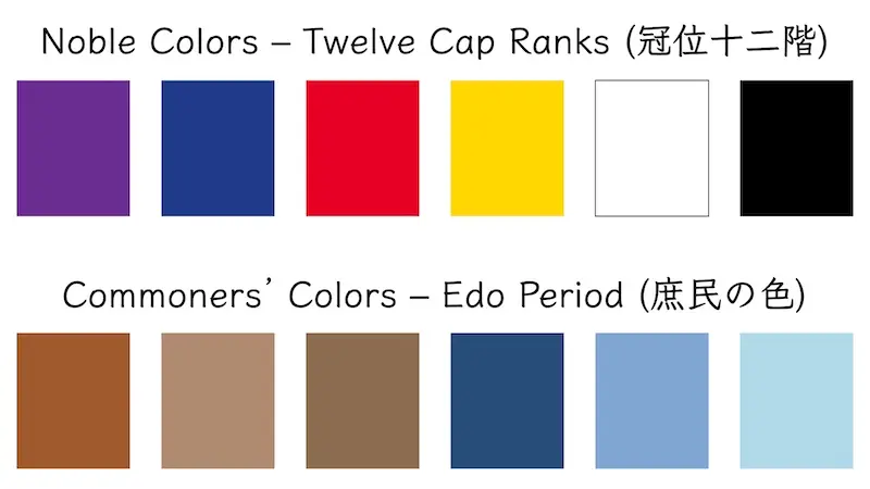
During the Asuka period (592–710), Prince Shōtoku (Shōtoku Taishi 聖徳太子) established the Twelve Cap Ranks (kan’i jūnikai 冠位十二階).
This system used the color of a cap to indicate an official’s rank.
At that time, purple was considered the highest rank color.
Purple dye, made from the root of the murasaki plant, was very labor-intensive and rare.
For this reason, purple became a symbol of authority.
Forbidden Colors for Commoners (Kinjiki)
Alongside refined culture, strict “color rules” also existed.
This was the system of kinjiki (禁色), colors forbidden to ordinary people.
Only the emperor and certain nobles were allowed to use these colors.
For people of that time, colors also represented the boundaries of social rank.
Enjoying the Seasons Through Color Combinations (Kasane no Irome)
During the Heian period (794–1185), Japan entered the era of the nobles.
For aristocrats, colors evolved into a way to “reflect nature’s changes in themselves.”
They expressed the seasons through the layering of kimono colors.
This practice is called kasane no irome (重ねの色目).
Nobles of the time were very sensitive to seasonal changes.
Here, we introduce the representative color combinations for each season.
-
・Spring: Cherry Blossoms (桜 – Sakura)[Outer] Pure White / Junpaku / 純白*The color may appear different depending on your screen*[Inner] Crimson / Kurenai / 紅*The color may appear different depending on your screen*
Expression: Cherry blossoms showing pink from behind the white petals.
-
・Summer: Iris (菖蒲 – Ayame)[Outer] Pine Needle Green / Matsuba / 松葉*The color may appear different depending on your screen*[Inner] Rose Pink / Koubai / 紅梅*The color may appear different depending on your screen*
Expression: The image of strong green leaves and vivid purple flowers.
-
・Autumn: Chrysanthemum (菊 – Kiku)[Outer] Pure White / Junpaku / 純白*The color may appear different depending on your screen*[Inner] Kyoto Purple / Kyomurasaki / 京紫*The color may appear different depending on your screen*
Expression: The elegant color of a chrysanthemum blooming in the cool autumn air.
-
・Winter: Snow on Pine (松の雪 – Matsunoyuki)[Outer] Pure White / Junpaku / 純白*The color may appear different depending on your screen*[Inner] Light Blue / Asagi / 浅葱*The color may appear different depending on your screen*
Expression: The appearance of white snow piled on top of pine needles.
The Transformation of Edo: Sumptuary Laws and Commoner Ingenuity
During the Edo period (1603–1868), the focus shifted to commoners (shomin 庶民).
However, the Tokugawa shogunate strictly limited their extravagance.
Sumptuary Laws (Shashikinshirei) Banning Flashy Colors
The shogunate prohibited commoners from dressing too flamboyantly.
Bright colors like red, purple, and gold were considered luxury items.
As a result, the colors allowed for commoners were mainly brown, gray, and indigo.
Enjoying Limitations: “Forty-Eight Browns and a Hundred Grays”
This is where the remarkable creativity of commoners emerged.
They thought, “If only muted colors are allowed, let’s create as many variations as possible.”
This idea became known as shijūhatcha hyakunezumi (四十八茶百鼠).
In reality, there were far more than 48 or 100 shades.
Slightly reddish grays, bluish browns — they named and enjoyed these subtle differences.
Restrictions sparked ingenuity.
This spirit nurtured the aesthetic of 粋 (いき, Iki).
Connections to the Present: Traditional Colors in Daily Life and Language
In the Reiwa era (2019–present), traditional colors are blending into our daily lives in new ways.
Modern Design and Japanese Language
Today, creators are rediscovering traditional colors.
“Japanese colors” are increasingly used in smartphone designs and stationery.
The subtle muted tones of traditional colors provide a calming, comfortable feeling for the eyes.
From the perspective of a Japanese language teacher, the history of color also lives on in words.
For example, a “blue traffic light” is actually green, but it is still called “blue.”
This naming reflects the ancient way of perceiving colors.
Learning a language is also a way to understand a country’s culture and its colors.
Conclusion
Traditional Japanese colors are more than just names.
They reflect how Japanese people have respected nature and cherished everyday life.
- Kinjiki (禁色) – colors that indicated rank and status
- Kasane no Irome (重ねの色目) – colors reflecting the seasons
- Iki (粋, Iki) – Edo-period aesthetic cultivated through creative limitations
By understanding the stories behind these colors, everyday scenery and Japanese expressions may feel a little richer.
I hope this article inspires you to look at the colors around you with fresh eyes.
If you want to learn more about the color indigo (ai-iro), check out this article:
[The Yukata (ゆかた): Japan’s Traditional Summer Robe, Its Meaning, and Japanese Words to Learn]
Japanese of the Day / 今日の日本語
- Word:__ (ローマ字) – 英語意味
- Meaning:英語で説明
- Example:日本語(ローマ字)
(英語の意味) - Fun Fact:
◆ Would you like to talk about Japanese culture? ◆
In the Culture Course, you can learn to speak about Japanese culture with me.
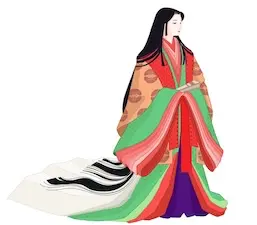
「華やかな十二単(じゅうにひとえ)の色彩に続き、今回は日本の伝統色の世界をさらに深く見ていきます。
日本の伝統色には、単なる「名前」以上の物語があります。
自然を敬い、不自由さえも「粋(いき)」に変えた先人たちの知恵。
その色彩豊かな世界を、日本語教師の視点で紐解きます。
貴族の時代:身分と色彩のルール
古代から中世にかけて、色は身分や教養を示す重要な記号でした。
まずは、色が「個人の自由」ではなかった時代のお話です。
聖徳太子の時代と「冠位十二階」
飛鳥時代 (592〜710年) 、聖徳太子は「冠位十二階」を定めました。 冠の色で役人の位(ランク)を示す制度です。
この時、最高位の色とされたのが「紫」でした。 紫草の根で染める紫は、大変な手間がかかる貴重な色。
そのため、紫は「権威」の象徴でした。
一般人には許されない「禁色(きんじき)」
雅な文化の一方で、厳しい「色のルール」もありました。 それが「禁色」という制度です。
天皇や特定の貴族以外、使うことが許されない色のことです。
当時の人々にとって、色とは身分の壁を示すものでもありました。
四季を楽しむ色の組み合わせ(重ねの色目)
平安時代 (794〜1185年) になると、貴族の時代へとなりました。
貴族にとって、色は「自然の移ろいと自分自身を重ねる」表現へと進化します。
そして、着物の色の重なりで季節を表現しました。 これを「重ねの色目(かさねのいろめ)」と呼びます。
当時の貴族は、季節の変化にとても敏感でした。 代表的な「色目」を季節ごとにご紹介します。
- 春:桜(さくら)
- 表:純白(じゅんぱく) / 裏:紅(くれない)
- 白い花びらから、ピンクの花が見える様子です。
- 夏:菖蒲(あやめ)
- 表:松葉(まつば) / 裏:紅梅(こうばい)
- 力強い緑の葉と、鮮やかな紫の花をイメージしています。
- 秋:菊(きく)
- 表:純白(じゅんぱく) / 裏:京紫(きょうむらさき)
- 秋の冷たい空気の中に咲く、気品ある菊の色です。
- 冬:松の雪(まつのゆき)
- 表:純白(じゅんぱく) / 裏:浅葱(あさぎ)
- 松の葉の上に、白い雪が積もった様子を表しています。
江戸の変革:奢侈禁止令と庶民の知恵
江戸時代 (1603〜1868年) 、主役は庶民(町人)へと移ります。 しかし、徳川幕府は彼らの贅沢を厳しく制限しました。
派手な色を禁じた「奢侈禁止令(しゃしきんしれい)」
幕府は、庶民が派手な格好をすることを禁じました。 赤、紫、金色といった鮮やかな色は「贅沢品」です。
そのため、庶民に許された色は、主に「茶色」「鼠色」「藍色」でした。
不自由を愉しむ「四十八茶百鼠」
ここで、庶民の驚くべき創造力が発揮されます。
「地味な色しかダメなら、その中でバリエーションを増やそう」と考えたのです。
これが「四十八茶百鼠(しじゅうはっちゃひゃくねずみ)」です。
実際には、48や100を遥かに超える色数がありました。
わずかに赤みを帯びた鼠色、青みを含んだ茶色。 その微妙な違いに名前を付けて楽しみました。
制限があるからこそ工夫する。この精神が「粋(いき)」の美意識を育てました。
現代への繋がり:生活と言葉に息づく伝統色
時代は令和 (2019年〜) 。伝統色は今、新しい形で私たちの生活に溶け込んでいます。
現代デザインと日本語の表現
現代のクリエイターも、伝統色を再発見しています。
スマホのカラーや文房具に「和の色」が使われることも増えました。
伝統色の「繊細なくすみ」は、目に心地よい安心感を与えます。
また、日本語教師の視点で見ると、言葉の中にも色の歴史が残っています。
例えば「青い信号」。実際には緑色でも「青」と呼ぶのは、古代の色の捉え方の名残です。
言葉を学ぶことは、その国の文化と「色」を知ることでもあります。
まとめ
日本の伝統色は、単なる色の名前ではありません。
それは、日本人が自然を敬い、日常を大切にしてきた証です。
- 身分や格式を示した「禁色」。
- 季節に心を寄せた「重ねの色目」。
- 制限の中で工夫した江戸の「粋」。
色の背景を知ることで、普段の景色や日本語の表現が少しだけ豊かに感じられるかもしれません。
この記事が、身の回りにある色を眺めるきっかけになれば幸いです。
藍色についてもっと知りたい方は、こちらの記事もご覧ください:
[The Yukata (ゆかた): Japan’s Traditional Summer Robe, Its Meaning, and Japanese Words to Learn]